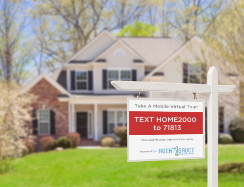
Virtual Tours are an important part of any Real Estate Marketing Platform. Virtual tours can also be the first exposure that a potential buyer has to a listing. This is why it is important for your virtual tour to look great. Below are three tips to help you enhance your virtual tours.
- Upload large photos – many agents will simply download photos from their listing system and import them into a virtual tour system. The problem with this is that many listing systems resize the original photos and they end up extremely small. At a minimum your photos should be 640px wide and 480px high. For the Digital Home Info system the optimal size of a photo is 1280px wide by 1024px high (unless you are using panoramic images). Images of this size will display very well in both the Animated and Full Screen virtual tours.
- Over saturate photos – Over saturating a photo is a process that makes colors seem brighter. In the Digital Home Info gallery there is a photo editor that will allow you to adjust the saturation of a photo. We have found that over saturating a photo by about 10% will cause the colors in most photos to appear much brighter without distorting the overall image.
- Number of photos – A prospective buyer is viewing a virtual tour for one reason. They are trying to determine if the listing is worth the effort of viewing in person. We have seen instances where agents upload 40, 50 or more photos to a virtual tour. While it is a great a way to show every aspect of the home it also allows a buyer to see things that might be on the “Deal Breaker” list. Things like a rough patch in a basement floor or really close neighboring homes. These are things that in person may not be as much of an issue but cause the buyer to pass before they ever see the listing in person. We recommend somewhere between 12 and 24 photos as the optimal number. This allows you to showcase the listing and leave a little mystery for the buyer to see when they get there.


